Google has already unveiled the latest version of Android, known as Android P. The tech giant is yet to spill the beans on what P stands for! So as of now you are free to make your own guesses, however, confine them to the confectioneries alone☺.
Our team of Android app developers was excited to play with the Android P developer preview 1 and they just got a glimpse of the features that the final version of Android P would bring. Here’s what we have to share with you.
UI enhancements
Our developers in the current developer preview 1 observed few UX/UI touch-ups and it is expected that Google would add still more new features and deal with some over the course of months. Few more developer previews are on the line till the final version is released. Let’s take a note at how the interface changes included in Android 9 Preview 1 differs from the features of Android Oreo.
New side-positioned volume panels
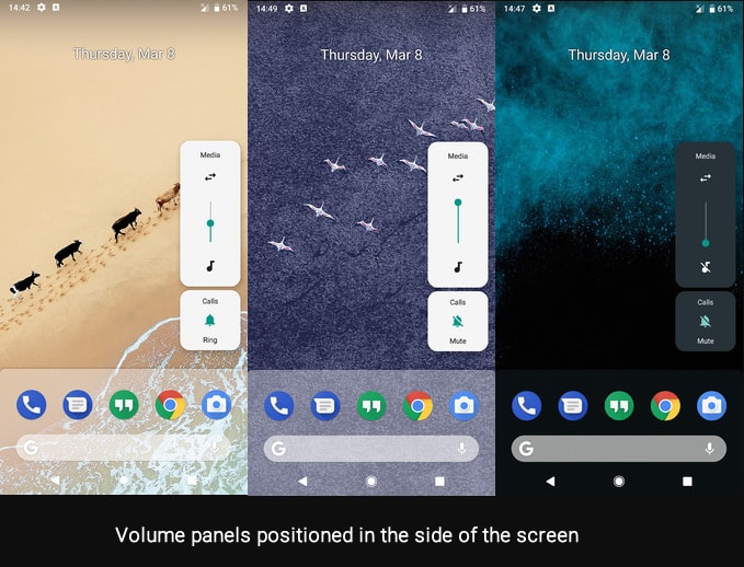
In Android P, the volume panel is positioned on the right of your screen and appears quite sleek and modern. It consists of two discrete elements:
- A volume slider which lets you mute all media sounds quickly and also enables you to control the volume of any accessory or connected device.
- A ring mode window that allows you to mute or unmute the sounds while it is ringing.
If you long-press any of these two elements then you will be taken to the sounds menu immediately.
Major revamp of quick settings
You will see a major overhaul in the Quick Setting tiles which now features teal-coloured circular icons. Furthermore, a big gap of several pixels separates the pending notifications from the quick settings. Our Android development experts found the new tiles a bit ugly, to be honest, and we hope that this change does not find its way to the final version of Android P.
Status bar clock repositioned

Well, call it a shock or surprise… the clock status bar clock has witnessed a major overhaul. It now rests on the top left part of the screen, which used to be in the top right corner since times immemorial. It appears that Google has made an attempt to build equilibrium between the two sides of a display with the notorious notch present. Otherwise, once you clear all the pending notifications the left one would remain unpopulated.
If you are finding this new change too awkward to accept then you can give your feedback to Google developers so that users are eventually allowed to choose the clock position as per their discretion.
Unwelcome tweaks in the dock
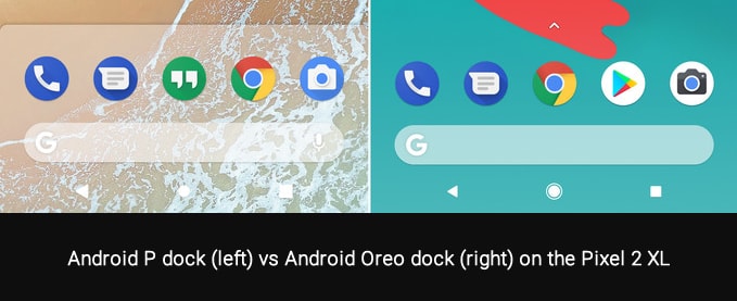
Google brings back the prominent white background, once seen in the first-gen Google Pixel/Pixel XL, with the default launcher of Android P – the Pixel Launcher P-4623511. No doubt the white background appears old-fashioned when compared to the visually appealing dock of the current Pixel stock. We very much wish that this change does not make it to the final version.
Colourful and vibrant settings menu
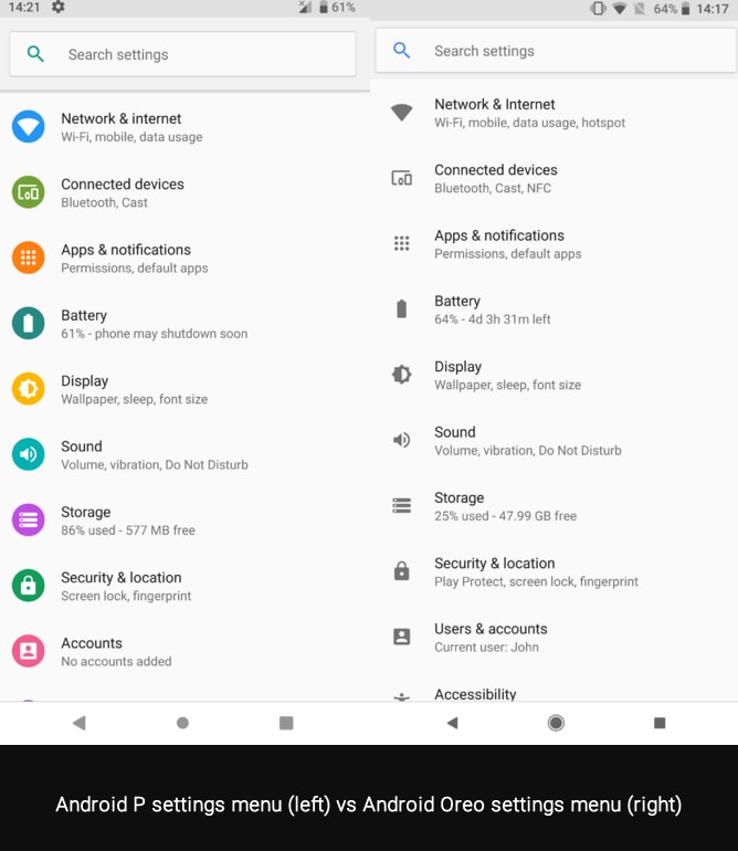
Do you find the monochrome icons of Android Oreo boring? If yes, then you would be happy to know that the Android team has iterated the main settings menu with colorful hues to sport lively icons. Some of our Android developers believe that they are going to miss the overall serious tone of the previous iteration. At the same time, few developers feel that the colorful icons in the settings menu appear way more playful.
New smart rotation mode
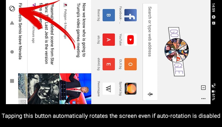
Currently, if you disable auto-rotation of the display from settings and then you have to go all the way to settings to enable it if you want to view something in a different orientation, right! Not anymore, as in Android P, a rotate icon will appear in the navigation bar. The screen will rotate once you tap the icon; otherwise, it will disappear in few seconds.
Message threads in notifications
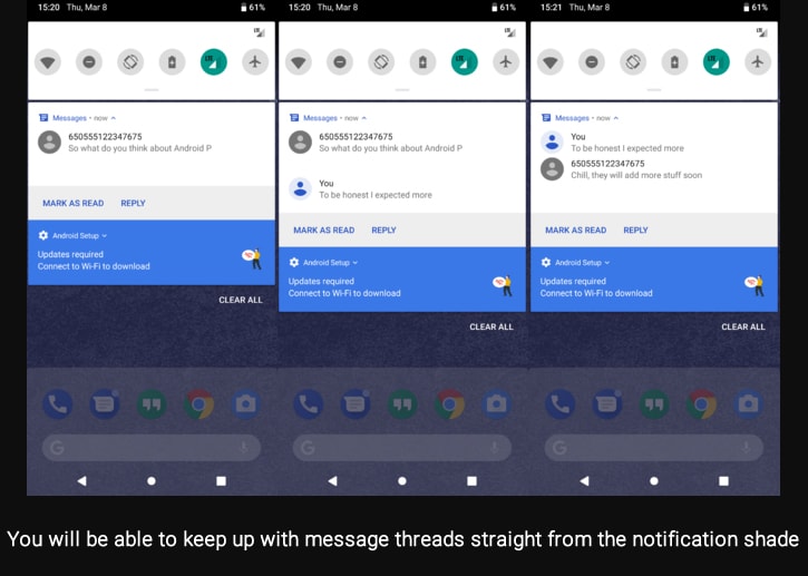
Now you can see messages as threads in your notifications. Usually, you would be able to see the last two messages at a time in the notification shade. This means that you would not need to leave your current screen in order to keep up with the events occurring in the thread. This is a welcome move by Google, which we think would be liked by most of the users.
Advanced screenshot controls

In case you do not like the hardware shortcut for screenshots, here is good news for you. Google is including useful features in stock Android; screenshot button is added to the power menu which will pop up if you simply hold up the power button. Tapping the screenshot button in the power menu you can quickly snap your screen now.
Changes for Android developers
- If an app is in the background of your phone and is inactive, it won’t be able to access your mic, camera and all SensorManager sensors; yes! Android P brings this restriction.
- Android P offers built-in support for more image and video codecs, which includes HDR VP9 Profile 2 and HEIF. So, HEIF would bring Android more in alignment with the way iOS does things. Furthermore, Google has promised that later this year, it would provide more information on “enhancing and refactoring the media APIs to make them easier to develop and integrate with.”
- If your phone is having more than two cameras on the back, then Android apps will be able to control them more granularly in a standard way. This is because Android P comes with a multi-camera API which would enable the apps to individually request data simultaneously from more than one camera sensor.
- Android P offers support for Wi-Fi RTT (Round-Trip-Time) allowing apps to get indoor positioning data with an accuracy of 1 to 2 meters. It operates by evaluating the distance to different Wi-Fi access points.
- You would no longer need to do a switch-apps-and-copy-and-switch-apps-and-paste dance as Android P comes with improved autofill making it easier for password managers to help you enter passwords for you.
- Enhanced performance for Android Runtime (ART) and applications are written in Kotlin.
- Google developers refine the power saving features Doze, App Standby, and Background Limits in order to further enhance battery life. You must try your apps with these and send feedback to Google Android developers.
- Android P is targeted at modernizing the foundations of Android and the applications that run on this platform thus ensuring long-term initiatives. All the apps submitted to the Google Play should aim their updates at Android Oreo by November 2018 and by 2019, they support 64-bit hardware.
- Google is also working towards improving app compatibility by encouraging developers to use Android’s public APIs from the SDK or NDK. Moreover, they are gradually restricting access to selected non-SDK interfaces.
When to expect the final version?

As shown in the figure above, you can expect the final version of Android P in mid-August which conforms to previous Android releases. Here’s a tentative breakdown of what you can expect from future Android P developer previews:
- Preview 1 (initial release, alpha)
- Preview 2 (incremental update, beta)
- Preview 3 (final APIs and official SDK, Play publishing, beta)
- Preview 4 (release candidate for testing)
- Preview 5 (release candidate for final testing)
- The final release of Android Open Source Project (AOSP) and ecosystem
Conclusion
Android P is shaped by the long long-termtiatives of the platform; however, in Preview 1 you can witness incremental improvements to the operating system. Being an Android app development company we expect more experimental overhauls and visual changes in the future previews and the final version.
By the way which changes you liked the most in Preview 1? What do you think “P” in Android P stands for? Please do feel free to share your views and wild guesses by leaving your comments below; we would love to hear from you. Also stay tuned for further updates about the features included in the final version.


