Micro-interactions are all around us! Applications, websites or appliances, all are micro-interaction-driven. Was turning off the alarm on your mobile phone, the first thing you did in the morning? Hey! You began your day with a micro-interaction. That is, you engaged with the user interface of your phone in a single moment. In fact, you would continue to engage in more such moments with your electronic devices throughout the day without even thinking about them because these moments are so small.
Recognizing the invisibility of these micro-interactions is very crucial for designers. It enables them to improve user experience vastly by designing and differentiating a great product from a good product. Micro-interactions can literally make or break a product. Being a web design company, we at Helios Solutions pay attention to minute details as well as the big picture. As a result, we have always succeeded in exceeding client satisfaction with our products and services.
According to Dan Saffer, the author of Micro-interactions: Designing with Details, “The difference between a product you love and the one you tolerate are often due to micro-interactions you have with it.”
What is a micro-interaction?
A contained product moment that revolves around a single use case that accomplishes one main task. It can be a single piece of functionality that exists on its own or it may exist around other pieces of larger features. It is intuitive and invisible; we almost fail to notice it unless it goes horribly wrong. Wondering how?
Also recommnded : Top 10 HTML/ CSS3 Front End Development Frameworks For Faster Web Development
Imagine you are in a concert, seated spellbound listening to the captivating voice of the singer. Suddenly, the ringer of your phone is all over the place. You realize that the ringer-off button is hard to find when you urgently need to silence it. This is an example of micro-interaction (silencing the phone) creating ill experience not only for you but for people around you, as well.
How do micro-interactions differ from features?
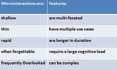
Micro-interactions are not features and here’s how they differ from each other (as depicted in the table below):
- The model for micro-interactions They help us to bridge the gap between machines and humans by making the interactions intuitive.
- If you care about user experience, you have to care about micro-interactions. If the latter are poor then no matter how nicely you design your main features, they would be always surrounded by pain as well as frustration.
- You can create signature moments by designing micro-interactions properly which in turn would not only boost adoption of your product or services but also customer loyalty. For example, the like-button in Facebook can be a signature moment.
- We exist in a multi-platform environment and micro-interactions can fit well into it by creating small interactions on small devices.
- It helps you to check and ensure that what’s fun doesn’t become annoying after repeated use and thus enables you to keep user experience elegant and streamlined.
A thought-fully crafted micro-interaction essentially comprises of the following four parts (shown in the figure below):
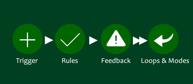
1. Trigger that initiates micro-interaction. It can be:
Manual trigger – the one that the user is deliberately doing like filling a form, pressing a button or swiping the screen.
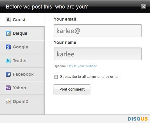
Let’s take a look at the form from Disqus. When you begin to fill your email address, it starts to guess your name based on your email address. Although, this is a little thing but it is certainly very clever.
System trigger – the system triggers on its own when a set of conditions are met.
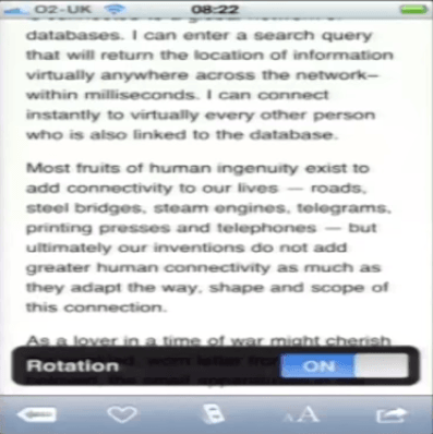
A very good example of system trigger is when you are reading on Instapaper and you tilt your phone and jerk it back, it brings up the rotation lock. It’s like, hey! You may want this. You need not go and dig into a setting somewhere to find the same.
2. Rules that determine how the micro-interaction functions. They are invisible and they decide what can be done and what cannot. It also determines how the micro-interaction responds to the trigger being activated.
For instance, the rules of a lamp turn on when the switch is flipped and stay on at full brightness until the switch is flipped again.
3. Feedback that is generated by the rules. They are mostly visuals but can be aural too.
GE Café appliances, for example, have used sound for each different actions like power on, notification, feature on , etc.
4. Loops and Modes that make up meta rules of micro-interaction. They are more effective as they can measure time everytime.
For example, on Facebook when you start making too many friends, it shows a warning like “Please slow down.”
How micro-interactions can take your product to the next level?
Keeping the following guidelines in mind while designing micro-interactions would help you to deliver pleasant user experience and win over your audience.
1. Bring the data forward
Do not make users to get into the application in order to get the data.
Example: With Google chrome you can actually see what has been downloaded, how many things have been downloaded and also the progress of the things that has been downloaded without having to go into Google chrome. Moreover, you need not go to any other separate window as it shows you what’s going on right there.
2. Prevent the human error
Stop errors from happening! Even if they happen, what can you do to automatically start to fix those errors?
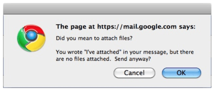
Example: In Gmail, if you write “I have attached a file…” and you actually forget to attach then a window pops up with the message, “Did you mean to attach files…?” Although it is creepy as Google is reading your mail, it is indeed effective in preventing human error.
3. Don’t start from zero
There is almost always something about the user, the context, the platform, the environment that you know what is going on.
Example: While you use navigation apps, after sometime they get to know your behaviour and start making suggestions or asking questions like “Going home?”
4. Use the overlooked
You, as a designer, already have a lot of tools or elements that are already there. What if you can use those things instead of adding new things onto the screen or dashboard or to the control panel?
Example: In chrome, when you search a word on a web page, it just uses the often overlooked scroll bar rather than popping up another window. “Convey the most with the least”.
5. Speak human
If your audience is non-technical then speak to them in the language of human. Try to figure out the basic message you need to convey and use the same words your users do.

Example: Threadless, the crowdsourced ecommerce company uses cart with faces that people could relate to. Sad face when the cart is empty and when you fill things into the cart, it changes to happy face.
6. Use the long loops
How does your micro-interaction change when you extend it beyond a single instance of use? How does the micro-interactions adapt to the user behaviour after you visit it twice, ten times or may be a thousand times? How does the product evolve overtime?
Example: In the foursquare app, they have created a yearlong loop such that it thanks you even after years. It’s kind of thanks for hanging out with us.
Wrapping up
Micro-interactions help you to consider each detail with care. Thus, it makes your audience feel that the product that they use is made with utmost attention and care. This enables you to build a long term relationship with your customers and boosts customer loyalty. If you are interested to create a website that appeals to your audience, please talk to our team of designers.
Hope it was a useful read! Do you think details are important? Can micro-interactions help you differentiate from your competitors? Let us begin a conversation; please share your thoughts by leaving your comments below.


I am very impressed with your site and also satisfied with your posts they very nice and very useful to us. Thanks for sharing the best posts they amazing.
Thank you for your comments. You can follow us on social media platforms and be the first to get updates about new posts.
https://www.linkedin.com/company/helios-solutions