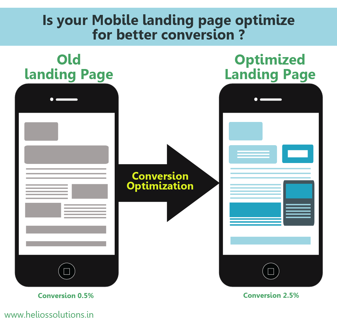
The task of a mobile landing page is to provide enough information to convert the visitor into a buyer, with much less space available to do so. The elements on the landing page should always avoid friction. The friction could be real or perceived. This friction can make the business lose a sale and a loyal customer; it should be avoided at all times.
The device:
The small device that the user uses is the first friction that they face. There’s no doubt about the friction being lower on desktops than on mobile devices. Users can view more and detailed information on desktops than on mobiles. As a result purchases are less likely to be made on smartphones. These smaller screens are mostly used to browse the internet and do researches, for a transaction, users choose to use other devices with bigger screens.
Loading time:
The page loads slowly on mobile devices and that creates more friction among the users making them leave the site. Some devices just don’t have the processing power to display all the information. Therefore, it is vital to optimize the page and keep it light for information to load faster and avoid irate customers.
Optimize the images:
The images used for the desktop might be of heavier files. The size of the image should be changed and reduced to fit the small screen of the mobile devices. Make sure to use images that will load faster and are better in quality to not let the users leave.
Readable content:
Content that is not readable can frustrate the users the most. There’s no point of being on a site that can even display proper content. Ensure to check the fonts and typeface to see if it works and looks well on a smaller device, most importantly it should be readable.
Follow these steps and avoid friction among the users.
Get in touch with us if you want to hire Responsive Design Specialist for your Website Development Project and for more information visit https://www.heliossolutions.co/web-application-development/


