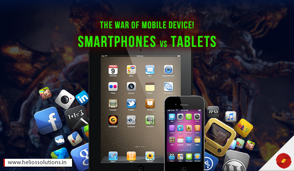
Among the most popular mobile devices, smartphones and tablets are the widely used devices across the globe. And this entails a big community of users where communication of businesses, people and cultures takes place through them. But does it make any difference in the overall UX design of a website or web application? To a great extent, this question has been underestimated. Many have assumed one Design works for all!
In order to answer this question and highlight the importance of UX design based on screen size, we have collected a few points that can add to your understanding. And since we are in the digital age where innovations like IoT, Artificial Intelligence and Machine Learning are invading the technological world, this aspect needs consideration before web development.
However, a smartphone and tablet are very close in shape and form making them very identical. But the fact is that according to the screen size and user behavior, the UX changes for each. Also, the purpose of usage is different for both the devices. This is the reason, we recommend to Go Responsive, so that your brand offers seamless user experience irrespective of device screen size or browsers.
For example, a user may browse products on a eCommerce platform but may not buy. The user may then go and buy the product while on the tablet. Because the tablet offers bigger view than the smartphone, so he feels surer of buying a particular product.
Now, let us explore the aspects that a web development expert or a solution architect must consider before defining the scope of requirements for a particular web development project or a mobile development project.
What is really mobile?
We are asking this question here to bring attention to the point that smartphones are real mobile device as a tablet is comparatively less convenient to be mobile. Smartphones are really mobile, can be carried anywhere and used wherever.
According to a report published in 2013 Adobe Digital Index Report, the average session length on mobile is half the session length on tablet devices.
The reason behind this is the environment of operation where tablets are generally being operated from home, or office where users have more time to browse and understand important information. The mobile users are not expecting much from the mobile yet, it is a device for ‘while on the go’.
See Also : Guidelines For Enterprise Application Integration
User Preferences Matter!
In this case, the socio economic factors like age, taste, preferences and trends matter! It is been observed and also the surveys have highlighted that millennials and those under 35 years prefer using smartphones and the older prefer using the tablet. Although for education purposes, even the millennials use the tablet. This is about the psychological behavior, needs and expectations of different age groups.
According to a report of Journalism Institute by Prof. Donald W. Reynolds, millennials (aged 18 – 34) are interested in smartphones than the older generation which is inclined towards tablets.
Thus, as a business if you are creating a product or selling a service for the masses, it is important that you offer them with user experiences that are specifically designed for devices. But you can target them more accurately if you go by the device size – tablets for the older and the smartphones for the millennials. Our mobile development experts tell us about the preferences can change the scope of requirements for any mobile development project.
Time Frame Matters!
Let’s make this more focused! Once you have considered the target audiences, their tastes and preferences you can also know which time frame, what devices are preferred by your users with the help of data analytics. For website, you can ask web development experts for a third party plugin integration for data analytics.
According a report by Pop Commerce, people mostly use apps for shopping in the afternoon and evening hours. And a report by Salesforce says that tablets are used in afternoon and evening hours during the weekends. This can highlight which devices are being actively used for what purpose! So your business can have improved targeting based on the device usage.
Purpose Changes with Size
Do not get us wrong! We are just saying that the devices screen size finally makes all the difference in the overall purpose of using a tablet or a smartphone. But taking it beyond the size, the battery is one thing that changes with the device. The smartphone battery drains faster than the battery of the tablet device. Many apps take full advantage of being browsed on the tablet device offering pleasing user experiences which may not be that exciting if viewed on mobile like reading a book. A user may enjoy that experience while using a larger screen size.
Finishing Up
Being prepared is playing it smart! So we recommend your web experiences must be prepared for all the incomings. As soon with IoT devices in picture, there are new browsers coming and there is going to be a demand to offer experience that are optimal for views across the new browsers and devices. For web solutions that consider UX design customized for device size, you can talk to our marketing experts, HTML5 and CSS3 development experts, web development experts and mobile development specialist who can offer feature integration for such analysis. See you until then next interesting read. Until then keep it technological!


